Information Architecture
What is included in the app?
Social Links
Info
Different categories that encapsulate the university
List the tools/modules in order:
Maps
Directory
Emergency
Events
News
MyIT
Students
MyWestern
Library
Shuttle
Help
Services
Wellbeing
Careers
Residences
Books
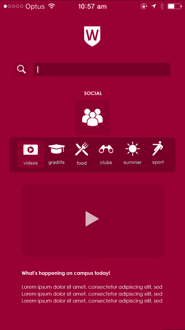
Food
Social
Summer
Clubs
Sport
How do you think they are clustered/organised?
The tools/modules provided on the app are all over the place and there isn’t a logical structure or order. However, they are organised in importance or have the most priority.
The only thing that looks organised is the social links as well as the info on the top right corner stating its importance or difference compared to the larger categories that help you either get around the university, the clubs or the shuttle bus.
Can you suggest categories for the modules?
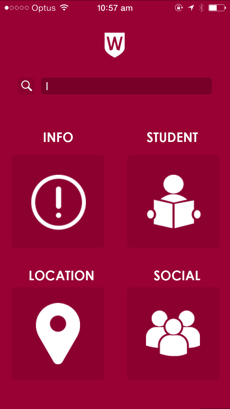
Student
Location
Social
Support
Services
Make a quick site flow (map) of the app. 2 levels is fine for this
Maps
|
Select a Campus
|
Parramatta South
|
EA Building
User Experience (UX)
Choose a task a typical student might want to do, and map 1 user flow through the app
Maps -> Takes you to a map that displays each university within Western Sydney -> You then choose which university you are allocated at -> each building is labelled and you choose which building your class is in -> you can get directions to this building -> GPS type of interface where you type your start location within the university -> choose walking or driving -> press route -> a blue line will appear that displays how to get to your chosen building from your current location
Are there any tasks or activities missing from the app? Can you suggest anything else?
I would suggest adding a timetable to the app because I find myself needing it just in case I do somehow forget where my lecture/tutorial is.
Somehow turn the vUWS site into an app that you are able to use on your phone because you can’t use all the features of the vUWS site on safari.
User Interface (UI)
Is the app easy to use?
The app is easy to use and it is straightforward.
Can you navigate easily?
It is very easy to navigate through
Do you have suggestions for changes?
Categorise all these tools because it is easier to navigate through if the user is familiarised with a certain category name and viewing all relevant tools in that category.
Visual Design
How do you describe the visual Design?
Icon based
Minimalistic
Grid based
Does it match the university’s brand image?
Yes
What improvements could be made?
Possibly colour coordination
Visual Design Remake
Take the screens included in this weeks folder and design visual improvements.

Before